Hi @grant1
I got one step further. I found my mistake, I seem to need to readd the _time column key AFTER the spread() function. Now I have this query worked out; for now I restrict everything to a single device (“tele/tasmota_office/SENSOR”). I also added a function to expand kWh back to Wh to distribute the points to larger numbers.
import "strings"

from(bucket: "homeassistant")
  |> range(start: -12mo, stop: -1d)
  |> filter(fn: (r) => r["_measurement"] == "tasmota")
  |> filter(fn: (r) => r["_field"] == "Total")
  |> filter(fn: (r) => r["topic"] == "tele/tasmota_office/SENSOR")
  |> map(fn: (r) =>  ({ r with topic: strings.replaceAll(v: strings.replaceAll(v: r.topic, t:"/SENSOR", u:""), t:"tele/tasmota_", u:"") }))
  |> window(every: 1d)
  |> spread()
  |> map(fn: (r) =>  ({ r with _time: r._start }))
  |> map(fn: (r) =>  ({ r with _value: r._value * 1000.0 }))
  |> yield(name: "Total Usage")
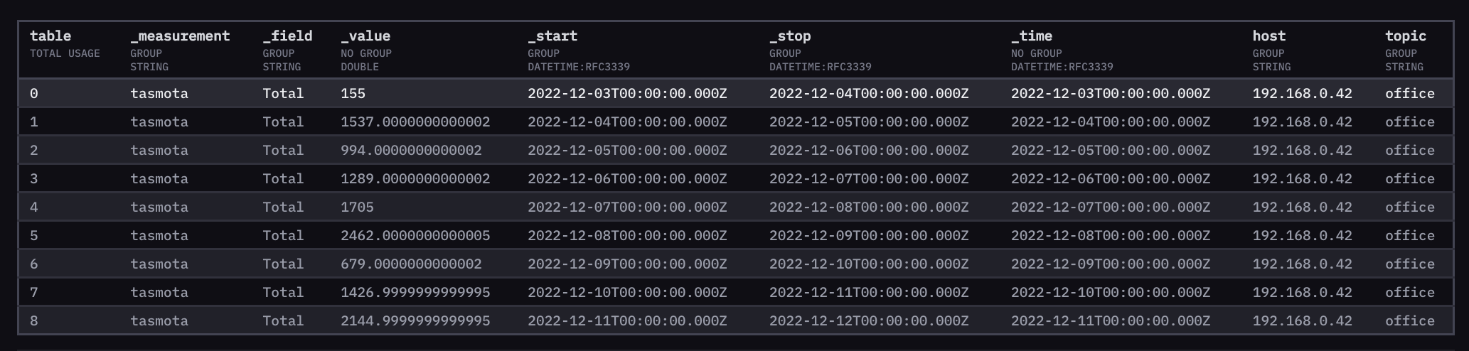
In the raw data output via influxdb Data Explorer, this data looks good to me:

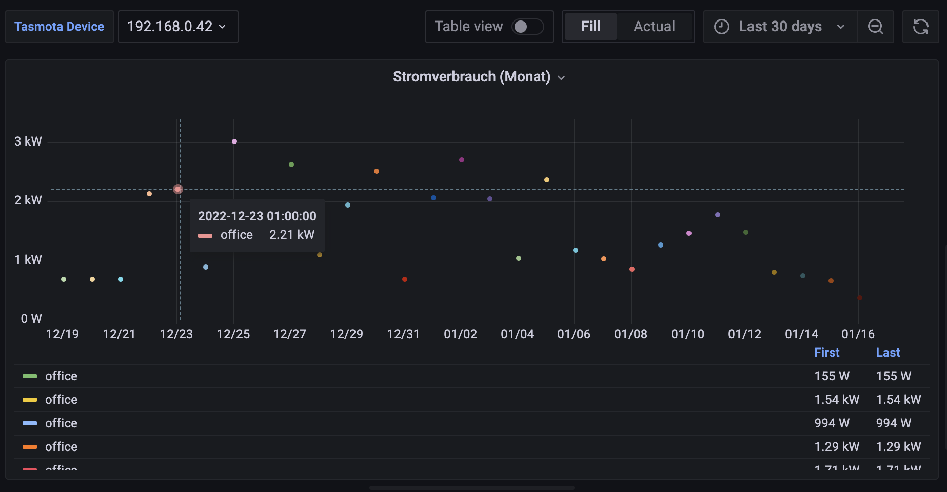
However. When I use this query in either influxdb Data Explorer “Graph” visualisation or Grafana, I don’t see a proper graph.
Data Explorer shows me an chart with proper X and Y axises showing the proper rangers for Watt and the date, but there are no points or bars. I set “Data X Column” to “time” and “Y column” to “_value”.
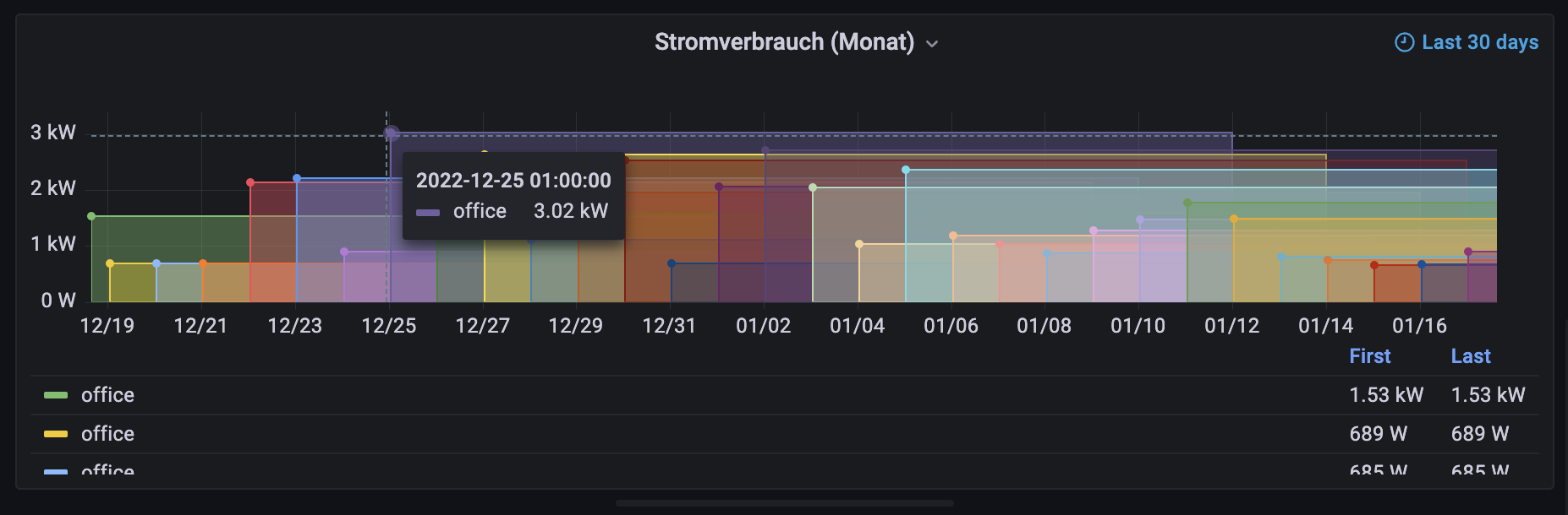
Funnily, if I put this into grafana, I get a similar issue with an empty graph, but I can see that grafana isn’t properly “merging” all data points. Maybe that’s the issue, but again I don’t really know how to fix it, see this screenshot:

I would actually expect there to be only one entry in the legend labelled office and the first value being that of the first day displayed, and last day of last day. I am sure something like a group function is missing here? I did add |> group() after the |> yield() but that didn’t work.
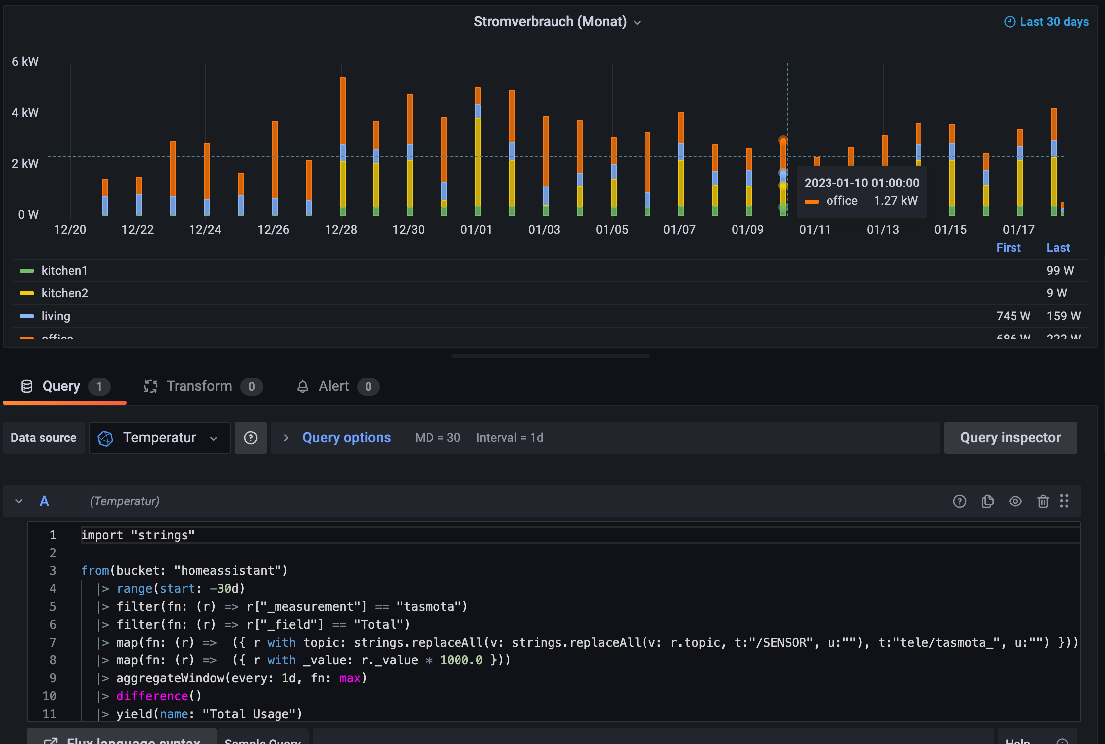
In grafana the graph is defined as “Time series” with no really configuration execept I specified the Y-Axis Unit, changed Display name to ${__field.labels.topic}, and no Value mappings, overrides or data links here.